Pagelet
Implements the basic Material Design visual layout structure.
Use it for projects that require a "page within a page" layouts with its own AppBar, BottomAppBar, NavigationDrawer, such as demos and galleries.
Inherits: LayoutControl, AdaptiveControl
Properties
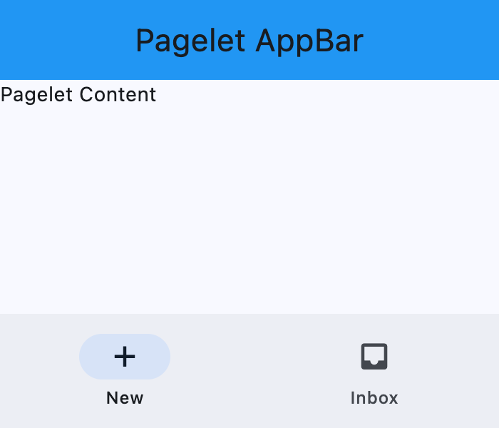
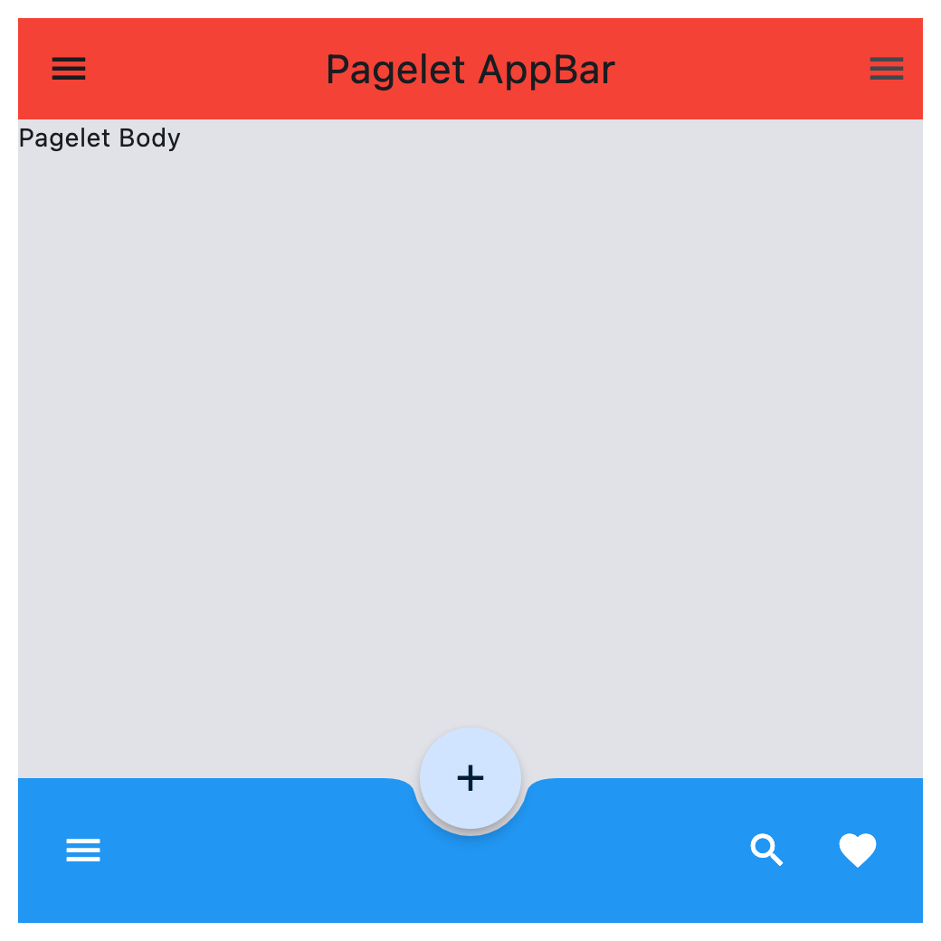
appbar- An AppBar control to display at the top of the Pagelet.bgcolor- Background color of this Pagelet.bottom_appbar- A BottomAppBar control to display at the bottom of this Pagelet.bottom_sheet- The persistent bottom sheet to show information that supplements the primary content of this Pagelet.content- A child Control contained by this Pagelet.drawer- A NavigationDrawer control to display as a panel sliding from the start edge of the page.end_drawer- A NavigationDrawer control to display as a panel sliding from the end edge of the page.floating_action_button- A FloatingActionButton control to display on top of this Pagelet's content.floating_action_button_location- Defines the position of the floating_action_button.navigation_bar- A navigation bar (NavigationBar or CupertinoNavigationBar) control to display at the bottom of thePagelet.
Methods
close_drawer- Close the drawer.close_end_drawer- Close the end drawer.show_drawer- Show the drawer.show_end_drawer- Show the end drawer.
Examples
Basic example
import asyncio

import flet as ft


def main(page: ft.Page):
    page.horizontal_alignment = ft.MainAxisAlignment.CENTER
    page.vertical_alignment = ft.CrossAxisAlignment.CENTER

    async def handle_show_drawer(e: ft.Event[ft.FloatingActionButton]):
        await pagelet.show_drawer()

    async def handle_show_end_drawer(e: ft.Event[ft.Button]):
        await pagelet.show_end_drawer()
        await asyncio.sleep(3)
        await pagelet.close_end_drawer()

    page.add(
        ft.SafeArea(
            content=(
                pagelet := ft.Pagelet(
                    width=500,
                    height=500,
                    appbar=ft.AppBar(
                        title=ft.Text("Pagelet AppBar"),
                        center_title=True,
                        bgcolor=ft.Colors.RED_500,
                    ),
                    content=ft.Text("Pagelet Body"),
                    bgcolor=ft.Colors.SURFACE_CONTAINER_HIGHEST,
                    bottom_appbar=ft.BottomAppBar(
                        bgcolor=ft.Colors.BLUE,
                        shape=ft.CircularRectangleNotchShape(),
                        content=ft.Row(
                            controls=[
                                ft.IconButton(
                                    icon=ft.Icons.MENU, icon_color=ft.Colors.WHITE
                                ),
                                ft.Container(expand=True),
                                ft.IconButton(
                                    icon=ft.Icons.SEARCH, icon_color=ft.Colors.WHITE
                                ),
                                ft.IconButton(
                                    icon=ft.Icons.FAVORITE, icon_color=ft.Colors.WHITE
                                ),
                            ],
                        ),
                    ),
                    drawer=ft.NavigationDrawer(
                        on_dismiss=lambda e: print("Drawer dismissed"),
                        controls=[
                            ft.NavigationDrawerDestination(
                                icon=ft.Icons.ADD_TO_HOME_SCREEN_SHARP,
                                label="Item 1",
                            ),
                            ft.NavigationDrawerDestination(
                                icon=ft.Icons.ADD_COMMENT,
                                label="Item 2",
                            ),
                        ],
                    ),
                    end_drawer=ft.NavigationDrawer(
                        on_dismiss=lambda e: print("End Drawer dismissed"),
                        controls=[
                            ft.NavigationDrawerDestination(
                                icon=ft.Icons.SLOW_MOTION_VIDEO,
                                label="Item 3",
                            ),
                            ft.NavigationDrawerDestination(
                                icon=ft.Icons.INSERT_CHART,
                                label="Item 4",
                            ),
                        ],
                    ),
                    floating_action_button=ft.FloatingActionButton(
                        icon=ft.Icons.ADD,
                        shape=ft.CircleBorder(),
                    ),
                    floating_action_button_location=ft.FloatingActionButtonLocation.CENTER_DOCKED,
                )
            ),
        )
    )


if __name__ == "__main__":
    ft.run(main)
Properties
appbarclass-attributeinstance-attribute
appbar: Optional[Union[AppBar, CupertinoAppBar]] = Nonebgcolorclass-attributeinstance-attribute
bgcolor: Optional[ColorValue] = NoneBackground color of this Pagelet.
bottom_appbarclass-attributeinstance-attribute
bottom_appbar: Optional[BottomAppBar] = NoneA BottomAppBar control to display at the bottom of this Pagelet.
If both the bottom_appbar and navigation_bar
properties are specified, bottom_appbar takes precedence and will
be displayed.
bottom_sheetclass-attributeinstance-attribute
bottom_sheet: Optional[Control] = NoneThe persistent bottom sheet to show information that supplements the primary content of this Pagelet.
contentinstance-attribute
content: Annotated[Control, V.visible_control()]A child Control contained by this Pagelet.
The control in the content of the Pagelet is positioned at the top-left of the available space between the app bar and the bottom of the Pagelet.
Raises:
- ValueError - If it is not visible.
drawerclass-attributeinstance-attribute
drawer: Optional[NavigationDrawer] = NoneA NavigationDrawer control to display as a panel sliding from the start edge of the page.
end_drawerclass-attributeinstance-attribute
end_drawer: Optional[NavigationDrawer] = NoneA NavigationDrawer control to display as a panel sliding from the end edge of the page.
floating_action_buttonclass-attributeinstance-attribute
floating_action_button: Optional[Control] = NoneA FloatingActionButton control to display on top of this Pagelet's content.
floating_action_button_locationclass-attributeinstance-attribute
floating_action_button_location: Optional[Union[FloatingActionButtonLocation, OffsetValue]] = FloatingActionButtonLocation.END_FLOATDefines the position of the floating_action_button.
navigation_barclass-attributeinstance-attribute
navigation_bar: Optional[Union[NavigationBar, CupertinoNavigationBar]] = NoneA navigation bar (NavigationBar or CupertinoNavigationBar) control to display at the bottom of the Pagelet.
If both the navigation_bar and bottom_appbar
properties are specified, navigation_bar takes precedence and will
be displayed.
Methods
show_end_drawerasync
show_end_drawer()Show the end drawer.
Raises:
- ValueError - If no end_drawer is defined.