Divider
A thin horizontal line (divider), with padding on either side.
ft.Column(
    width=240,
    spacing=10,
    controls=[
        ft.Text("Section A", weight=ft.FontWeight.W_600),
        ft.Divider(),
        ft.Text("Section B"),
    ],
)

Inherits: Control
Properties
color- The color to use when painting the line.height- The divider's height extent.leading_indent- The amount of empty space to the leading edge of the divider.radius- The border radius of the divider.thickness- The thickness of the line drawn within the divider.trailing_indent- The amount of empty space to the trailing edge of the divider.
Examples
Basic Example
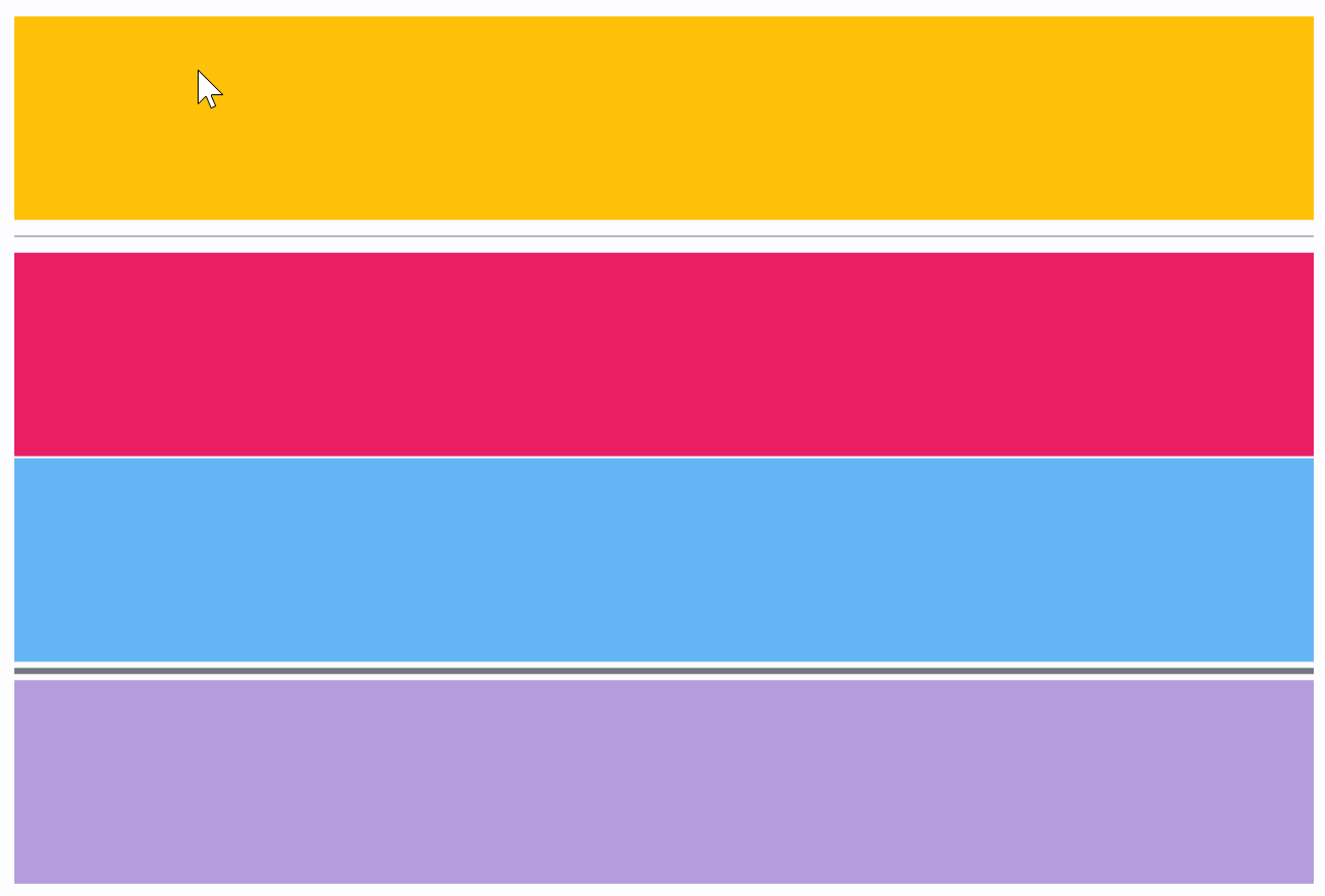
import flet as ft


def main(page: ft.Page):
    page.add(
        ft.SafeArea(
            expand=True,
            content=ft.Column(
                spacing=0,
                expand=True,
                controls=[
                    ft.Container(
                        expand=True,
                        bgcolor=ft.Colors.AMBER,
                        alignment=ft.Alignment.CENTER,
                    ),
                    ft.Divider(),
                    ft.Container(
                        expand=True,
                        bgcolor=ft.Colors.PINK,
                        alignment=ft.Alignment.CENTER,
                    ),
                    ft.Divider(height=1, color=ft.Colors.WHITE),
                    ft.Container(
                        expand=True,
                        bgcolor=ft.Colors.BLUE_300,
                        alignment=ft.Alignment.CENTER,
                    ),
                    ft.Divider(height=9, thickness=3),
                    ft.Container(
                        expand=True,
                        bgcolor=ft.Colors.DEEP_PURPLE_200,
                        alignment=ft.Alignment.CENTER,
                    ),
                ],
            ),
        )
    )


if __name__ == "__main__":
    ft.run(main)
Properties
colorclass-attributeinstance-attribute
color: Optional[ColorValue] = NoneThe color to use when painting the line.
If None, flet.DividerTheme.color is used.
heightclass-attributeinstance-attribute
height: Annotated[Optional[Number], V.ge(0)] = NoneThe divider's height extent. The divider itself is always drawn as a horizontal line that is centered within the height specified by this value.
If None, flet.DividerTheme.space is used.
If that's is also None, defaults to 16.0.
Raises:
- ValueError - If height is negative.
leading_indentclass-attributeinstance-attribute
leading_indent: Annotated[Optional[Number], V.ge(0)] = NoneThe amount of empty space to the leading edge of the divider.
If None, flet.DividerTheme.leading_indent is used.
If that's is also None, defaults to 0.0.
Raises:
- ValueError - If it is not greater than or equal to
0.
radiusclass-attributeinstance-attribute
radius: Optional[BorderRadiusValue] = NoneThe border radius of the divider.
thicknessclass-attributeinstance-attribute
thickness: Annotated[Optional[Number], V.ge(0)] = NoneThe thickness of the line drawn within the divider.
A divider with a thickness of 0.0 is always drawn as a line with a
height of exactly one device pixel.
If None, flet.DividerTheme.thickness is used.
If that is also None, defaults to 0.0.
Raises:
- ValueError - If thickness is negative.
trailing_indentclass-attributeinstance-attribute
trailing_indent: Annotated[Optional[Number], V.ge(0)] = NoneThe amount of empty space to the trailing edge of the divider.
If None, flet.DividerTheme.trailing_indent is used.
If that is also None, defaults to 0.0.
Raises:
- ValueError - If it is not greater than or equal to
0.