CupertinoListTile
An iOS-style list tile.
The CupertinoListTile is a Cupertino equivalent of the Material ListTile.
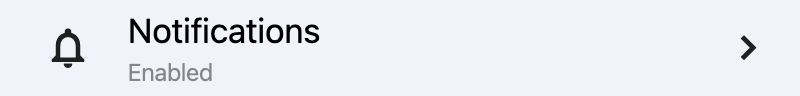
ft.CupertinoListTile(
    title="Notifications",
    subtitle="Enabled",
    width=400,
    leading=ft.Icon(ft.Icons.NOTIFICATIONS_OUTLINED),
    trailing=ft.Icon(ft.Icons.CHEVRON_RIGHT),
    bgcolor=ft.Colors.SURFACE_CONTAINER_LOW,
)
Inherits: LayoutControl
Properties
additional_info- AControlto display on the right of the list tile, before trailing.bgcolor- The background color of this list tile.bgcolor_activated- The background color of this list tile after it was tapped.leading- A control to display before the title.leading_size- Used to constrain the width and height of leading control.leading_to_title- The horizontal space between leading and title.notched- Whether this list tile should be created in an "Inset Grouped" form, known from either iOS Notes or Reminders app.padding- The tile's internal padding.subtitle- Additional content displayed below the title.title- The primary content of this list tile.toggle_inputs- Whether clicking on this tile should toggle the state of (visible) toggleable controls like Radio, Checkbox or Switch inside it.trailing- A control to display after the title.url- The URL to open when this button is clicked.
Events
on_click- Called when a user clicks/taps the list tile.
Examples
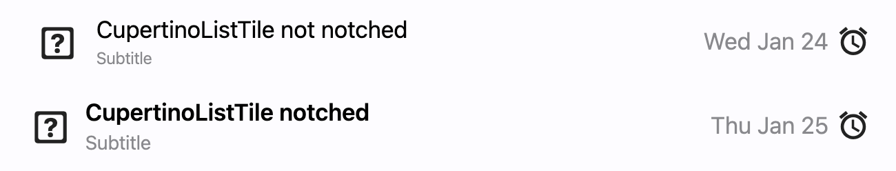
Notched and non-notched list tiles
import flet as ft


def main(page: ft.Page):
    def handle_tile_click(_: ft.Event[ft.CupertinoListTile]):
        print("Tile clicked")

    page.add(
        ft.SafeArea(
            content=ft.Column(
                controls=[
                    ft.CupertinoListTile(
                        additional_info=ft.Text("Wed Jan 24"),
                        bgcolor_activated=ft.Colors.AMBER_ACCENT,
                        leading=ft.Icon(ft.CupertinoIcons.GAME_CONTROLLER),
                        title=ft.Text("CupertinoListTile: notched = False"),
                        subtitle=ft.Text("Subtitle"),
                        trailing=ft.Icon(ft.CupertinoIcons.ALARM),
                        on_click=handle_tile_click,
                    ),
                    ft.CupertinoListTile(
                        notched=True,
                        additional_info=ft.Text("Thu Jan 25"),
                        leading=ft.Icon(ft.CupertinoIcons.GAME_CONTROLLER),
                        title=ft.Text("CupertinoListTile: notched = True"),
                        subtitle=ft.Text("Subtitle"),
                        trailing=ft.Icon(ft.CupertinoIcons.ALARM),
                        on_click=handle_tile_click,
                    ),
                ],
            ),
        )
    )


if __name__ == "__main__":
    ft.run(main)
Properties
additional_infoclass-attributeinstance-attribute
additional_info: Optional[StrOrControl] = NoneA Control to display on the right of the list tile, before trailing.
Similar to subtitle, an additional_info is used to display additional information.
Typically a Text control.
bgcolorclass-attributeinstance-attribute
bgcolor: Optional[ColorValue] = NoneThe background color of this list tile.
bgcolor_activatedclass-attributeinstance-attribute
bgcolor_activated: Optional[ColorValue] = NoneThe background color of this list tile after it was tapped.
leadingclass-attributeinstance-attribute
leading: Optional[IconDataOrControl] = NoneA control to display before the title.
leading_sizeclass-attributeinstance-attribute
leading_size: Optional[Number] = NoneUsed to constrain the width and height of leading control.
Defaults to 30.0, if notched is True, else 28.0.
leading_to_titleclass-attributeinstance-attribute
leading_to_title: Optional[Number] = NoneThe horizontal space between leading and title.
Defaults to 12.0, if notched is True, else 16.0.
notchedclass-attributeinstance-attribute
notched: bool = FalseWhether this list tile should be created in an "Inset Grouped" form, known from either iOS Notes or Reminders app.
paddingclass-attributeinstance-attribute
padding: Optional[PaddingValue] = NoneThe tile's internal padding. Insets a CupertinoListTile's contents: its leading, title, subtitle, additional_info and trailing controls.
subtitleclass-attributeinstance-attribute
subtitle: Optional[StrOrControl] = NoneAdditional content displayed below the title.
Typically a Text control.
titleinstance-attribute
title: Annotated[StrOrControl, V.str_or_visible_control()]The primary content of this list tile.
Typically a Text control.
Raises:
- ValueError - If it is neither a string nor a visible
Control.
toggle_inputsclass-attributeinstance-attribute
toggle_inputs: bool = FalseWhether clicking on this tile should toggle the state of (visible) toggleable controls like Radio, Checkbox or Switch inside it.
trailingclass-attributeinstance-attribute
trailing: Optional[IconDataOrControl] = NoneA control to display after the title.
Typically an Icon control.
Events
on_clickclass-attributeinstance-attribute
on_click: Optional[ControlEventHandler[CupertinoListTile]] = NoneCalled when a user clicks/taps the list tile.