OutlinedButton
Outlined buttons are medium-emphasis buttons. They contain actions that are important, but aren't the primary action in an app. Outlined buttons pair well with filled buttons to indicate an alternative, secondary action.
Example:
ft.OutlinedButton(content="Outlined button")

Inherits: LayoutControl, AdaptiveControl
Properties
autofocus- True if the control will be selected as the initial focus.clip_behavior- The content will be clipped (or not) according to this option.content- A Control representing custom button content.icon- An icon to display in this button.icon_color- Icon color.styleurl- The URL to open when this button is clicked.
Events
on_blur- Called when this button has lost focus.on_click- Called when a user clicks this button.on_focus- Called when this button has received focus.on_hover- Called when a mouse pointer enters or exists this button's response area.on_long_press- Called when this button is long-pressed.
Methods
focus- Requests focus for this control.
Examples
Basic example
import flet as ft
def main(page: ft.Page):
page.title = "OutlinedButton Example"
page.add(
ft.SafeArea(
content=ft.Column(
controls=[
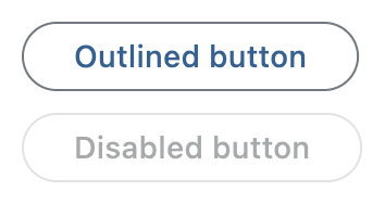
ft.OutlinedButton(content="Outlined button"),
ft.OutlinedButton(content="Disabled button", disabled=True),
]
)
)
)
if __name__ == "__main__":
ft.run(main)
Handling clicks
import flet as ft
def main(page: ft.Page):
page.title = "OutlinedButton Example"
page.theme_mode = ft.ThemeMode.LIGHT
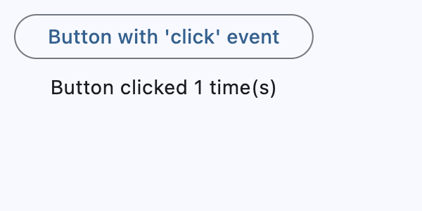
def handle_button_click(e: ft.Event[ft.OutlinedButton]):
button.data += 1
message.value = f"Button clicked {button.data} time(s)"
page.update()
button = ft.OutlinedButton(
content="Button with 'click' event",
data=0,
on_click=handle_button_click,
)
message = ft.Text()
page.add(
ft.SafeArea(
content=ft.Column(
controls=[button, message],
alignment=ft.MainAxisAlignment.CENTER,
horizontal_alignment=ft.CrossAxisAlignment.CENTER,
expand=True,
)
)
)
if __name__ == "__main__":
ft.run(main)
Icons
import flet as ft
def main(page: ft.Page):
page.title = "OutlinedButton Example"
page.add(
ft.SafeArea(
content=ft.Column(
controls=[
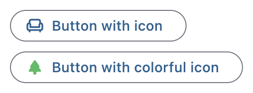
ft.OutlinedButton(
content="Button with icon", icon=ft.Icons.CHAIR_OUTLINED
),
ft.OutlinedButton(
content="Button with colorful icon",
icon=ft.Icons.PARK_ROUNDED,
icon_color=ft.Colors.GREEN_400,
),
]
)
)
)
if __name__ == "__main__":
ft.run(main)
Custom content
import flet as ft
def main(page: ft.Page):
page.title = "OutlinedButton Example"
page.theme_mode = ft.ThemeMode.LIGHT
page.add(
ft.SafeArea(
content=ft.Column(
controls=[
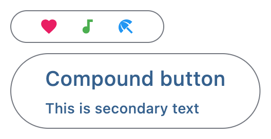
ft.OutlinedButton(
width=150,
content=ft.Row(
alignment=ft.MainAxisAlignment.SPACE_AROUND,
controls=[
ft.Icon(ft.Icons.FAVORITE, color=ft.Colors.PINK),
ft.Icon(ft.Icons.AUDIOTRACK, color=ft.Colors.GREEN),
ft.Icon(ft.Icons.BEACH_ACCESS, color=ft.Colors.BLUE),
],
),
),
ft.OutlinedButton(
content=ft.Container(
padding=ft.Padding.all(10),
content=ft.Column(
alignment=ft.MainAxisAlignment.CENTER,
spacing=5,
controls=[
ft.Text(value="Compound button", size=20),
ft.Text(value="This is secondary text"),
],
),
),
),
],
)
)
)
if __name__ == "__main__":
ft.run(main)
Properties
autofocusclass-attributeinstance-attribute
autofocus: bool = FalseTrue if the control will be selected as the initial focus.
If there is more than one control on a page with autofocus set, then the first one added to the page will get focus.
clip_behaviorclass-attributeinstance-attribute
clip_behavior: ClipBehavior = ClipBehavior.NONEThe content will be clipped (or not) according to this option.
contentclass-attributeinstance-attribute
content: Optional[StrOrControl] = NoneA Control representing custom button content.
Raises:
- ValueError - If neither icon nor
contentis provided.
iconclass-attributeinstance-attribute
icon: Optional[IconDataOrControl] = NoneAn icon to display in this button.
styleclass-attributeinstance-attribute
style: Optional[ButtonStyle] = NoneEvents
on_blurclass-attributeinstance-attribute
on_blur: Optional[ControlEventHandler[OutlinedButton]] = NoneCalled when this button has lost focus.
on_clickclass-attributeinstance-attribute
on_click: Optional[ControlEventHandler[OutlinedButton]] = NoneCalled when a user clicks this button.
on_focusclass-attributeinstance-attribute
on_focus: Optional[ControlEventHandler[OutlinedButton]] = NoneCalled when this button has received focus.
on_hoverclass-attributeinstance-attribute
on_hover: Optional[ControlEventHandler[OutlinedButton]] = NoneCalled when a mouse pointer enters or exists this button's response area.
data property of event object contains true (string) when cursor enters and
false when it exits.
on_long_pressclass-attributeinstance-attribute
on_long_press: Optional[ControlEventHandler[OutlinedButton]] = NoneCalled when this button is long-pressed.